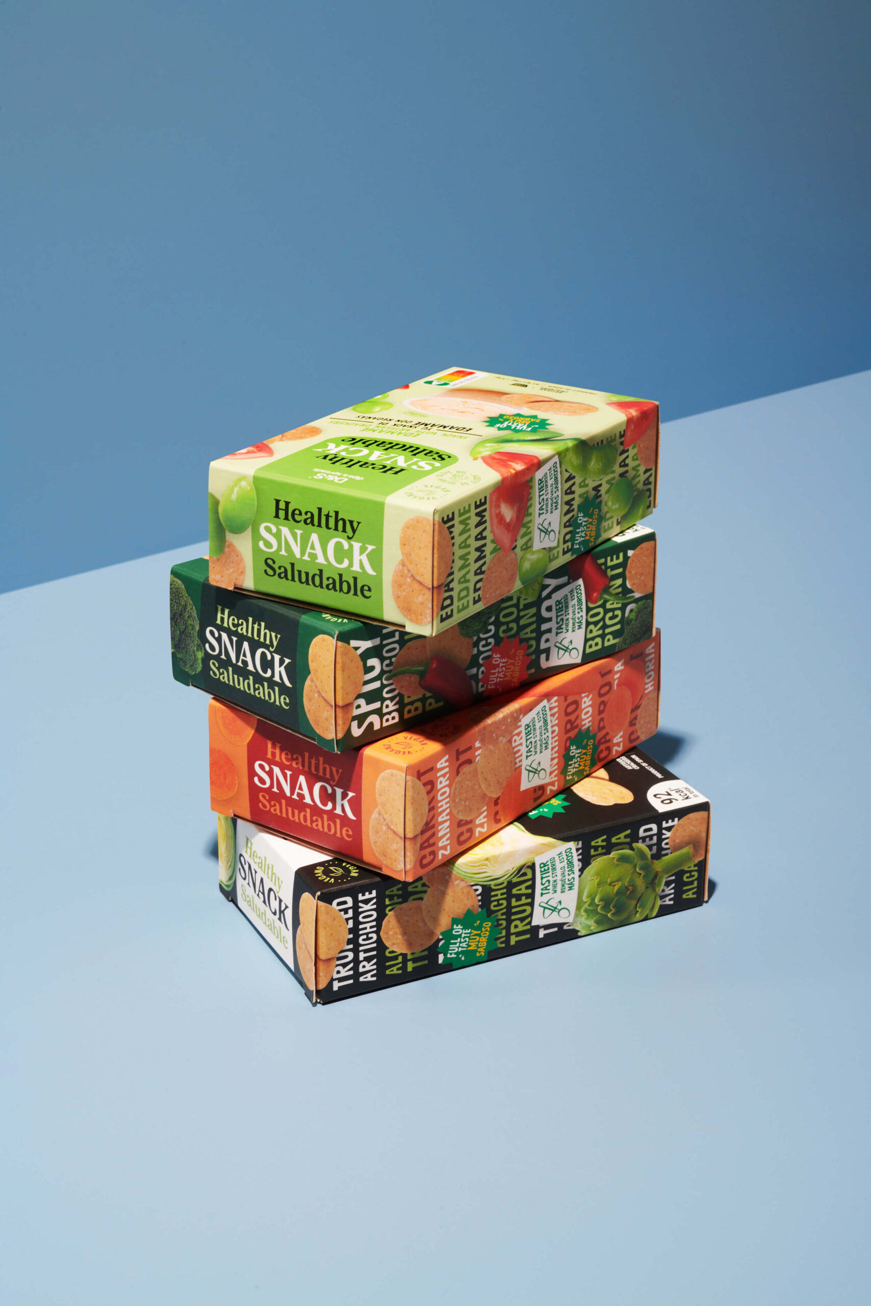
Más que un diseño de envase, el proyecto define un lenguaje escalable capaz de crecer con nuevas referencias y formatos. Una propuesta sólida que ordena, diferencia y posiciona la marca en un territorio propio dentro del mercado healthy.
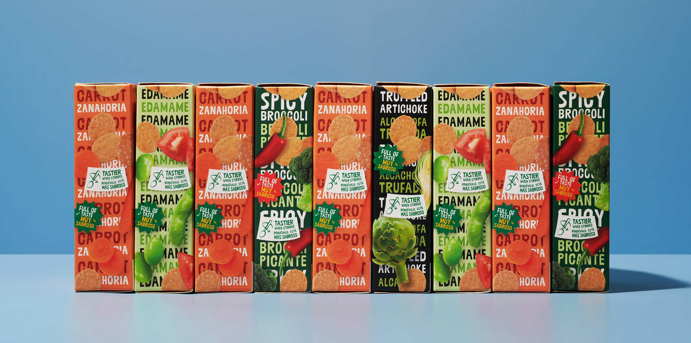
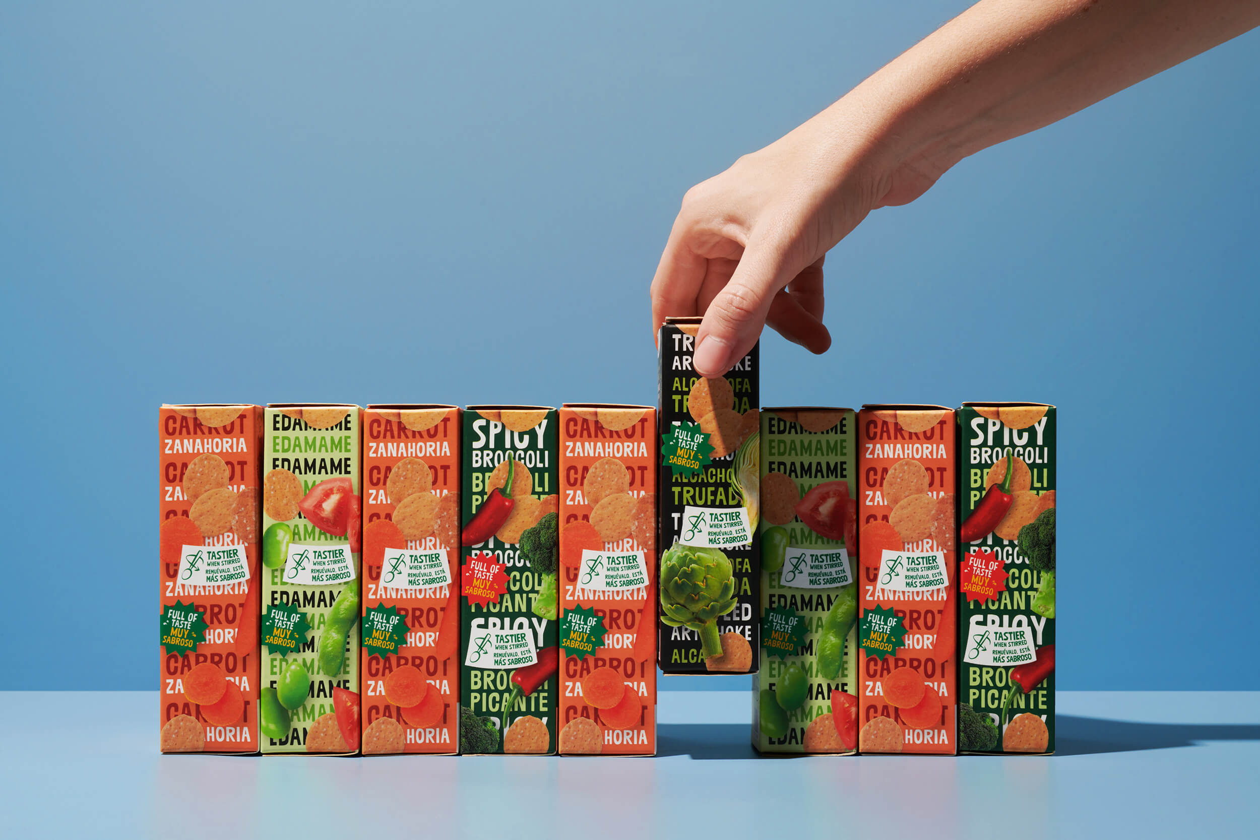
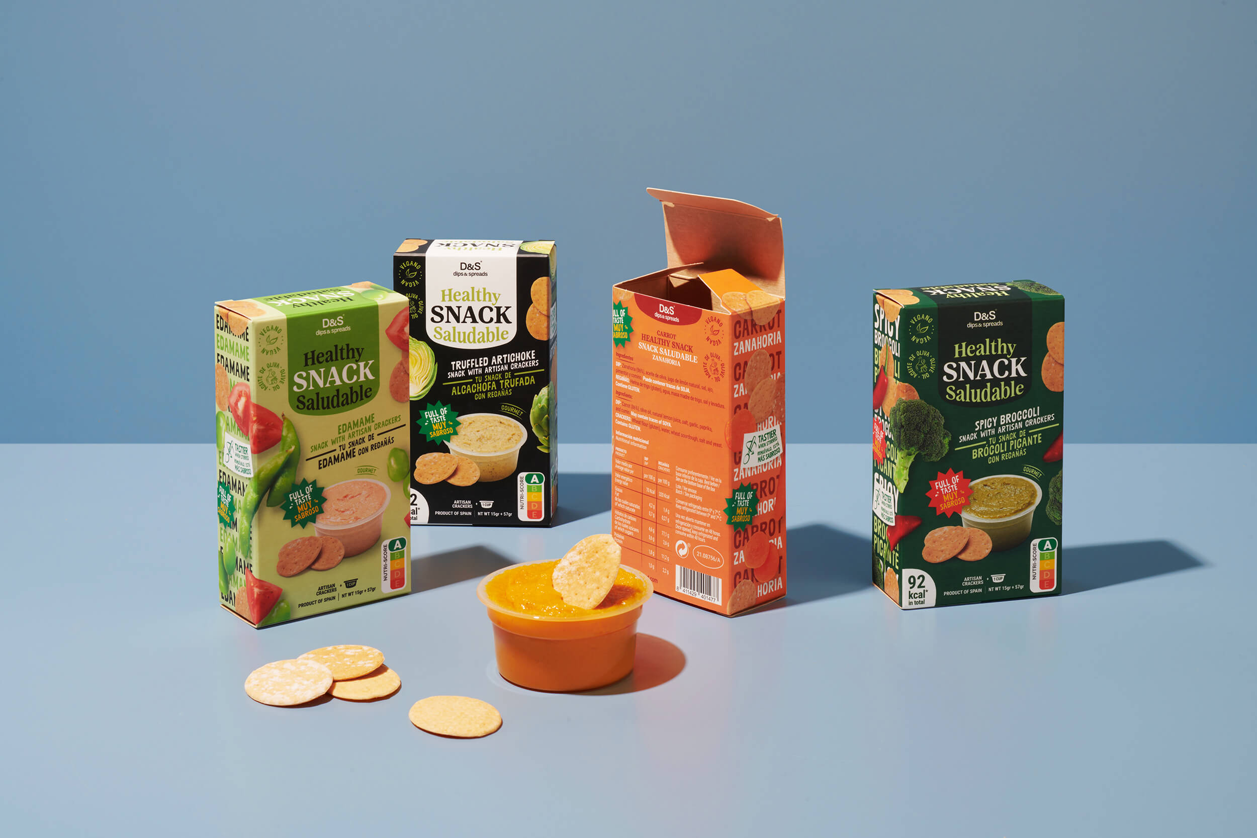
Este proyecto construye un universo visual fresco, directo y contemporáneo dentro de la categoría de alimentación saludable. A través de un sistema de packaging claro y altamente reconocible, la marca organiza su gama de sabores mediante un código cromático contundente que facilita la navegación y refuerza su presencia en lineal.
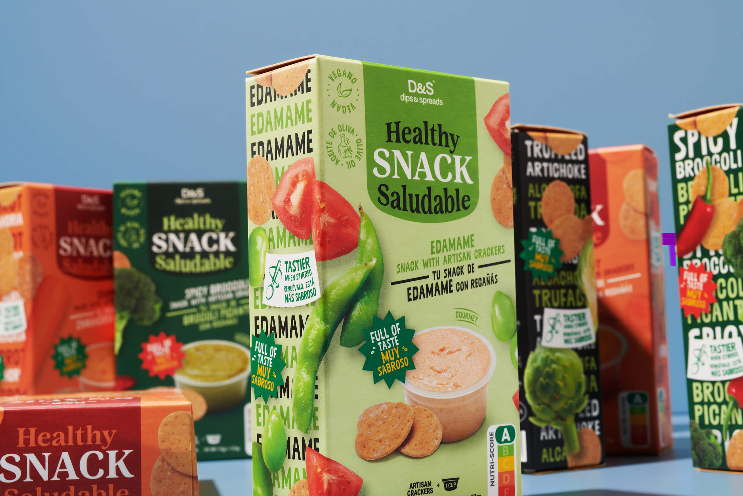
La arquitectura gráfica equilibra información y apetito visual. El producto se muestra sin artificios, protagonista y honesto, mientras que la tipografía combina carácter y cercanía para comunicar de forma clara los atributos clave: saludable, práctico y sabroso. El resultado es una identidad dinámica que conecta con un consumidor consciente, sin renunciar a la energía ni a la personalidad.