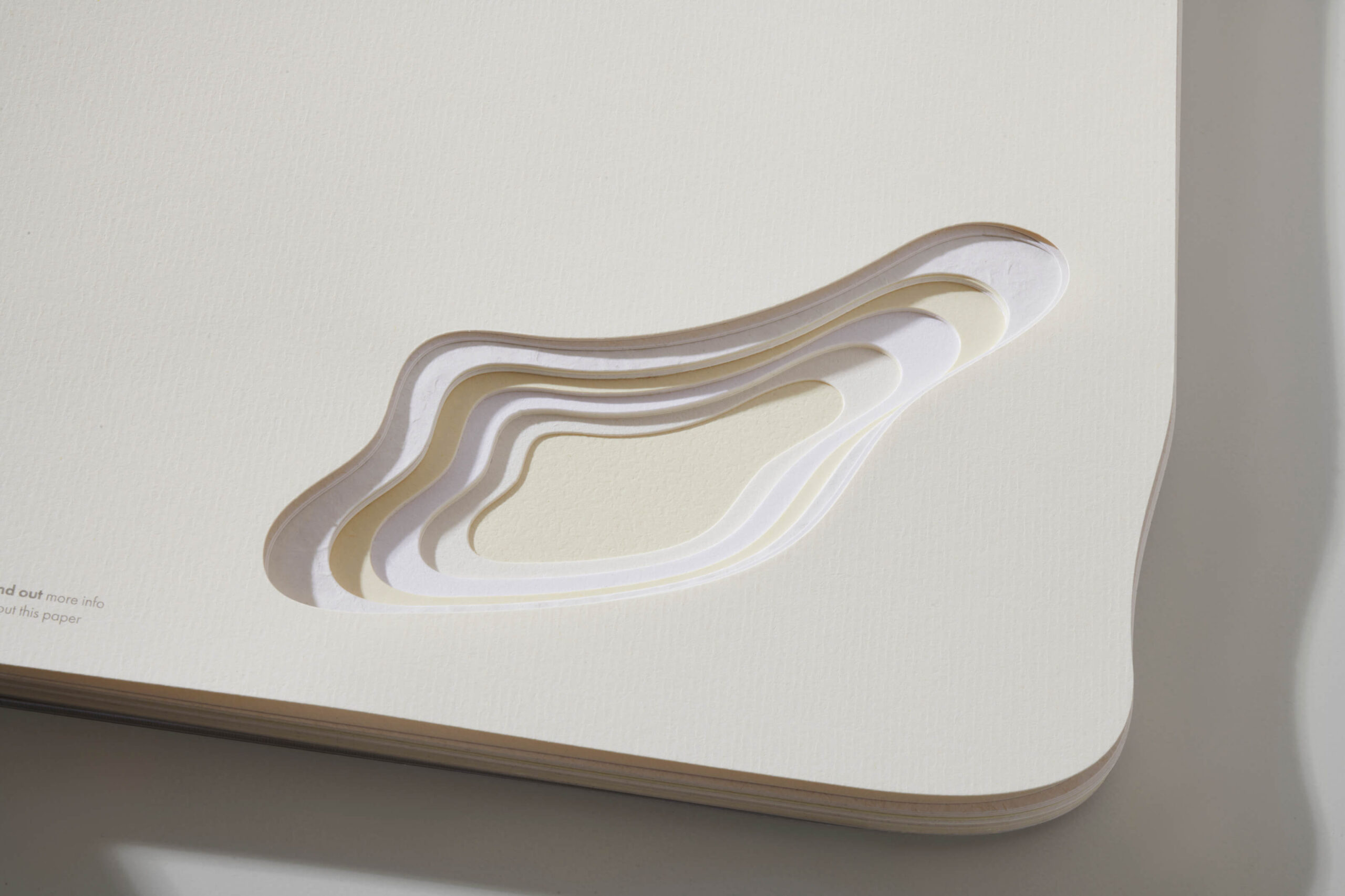
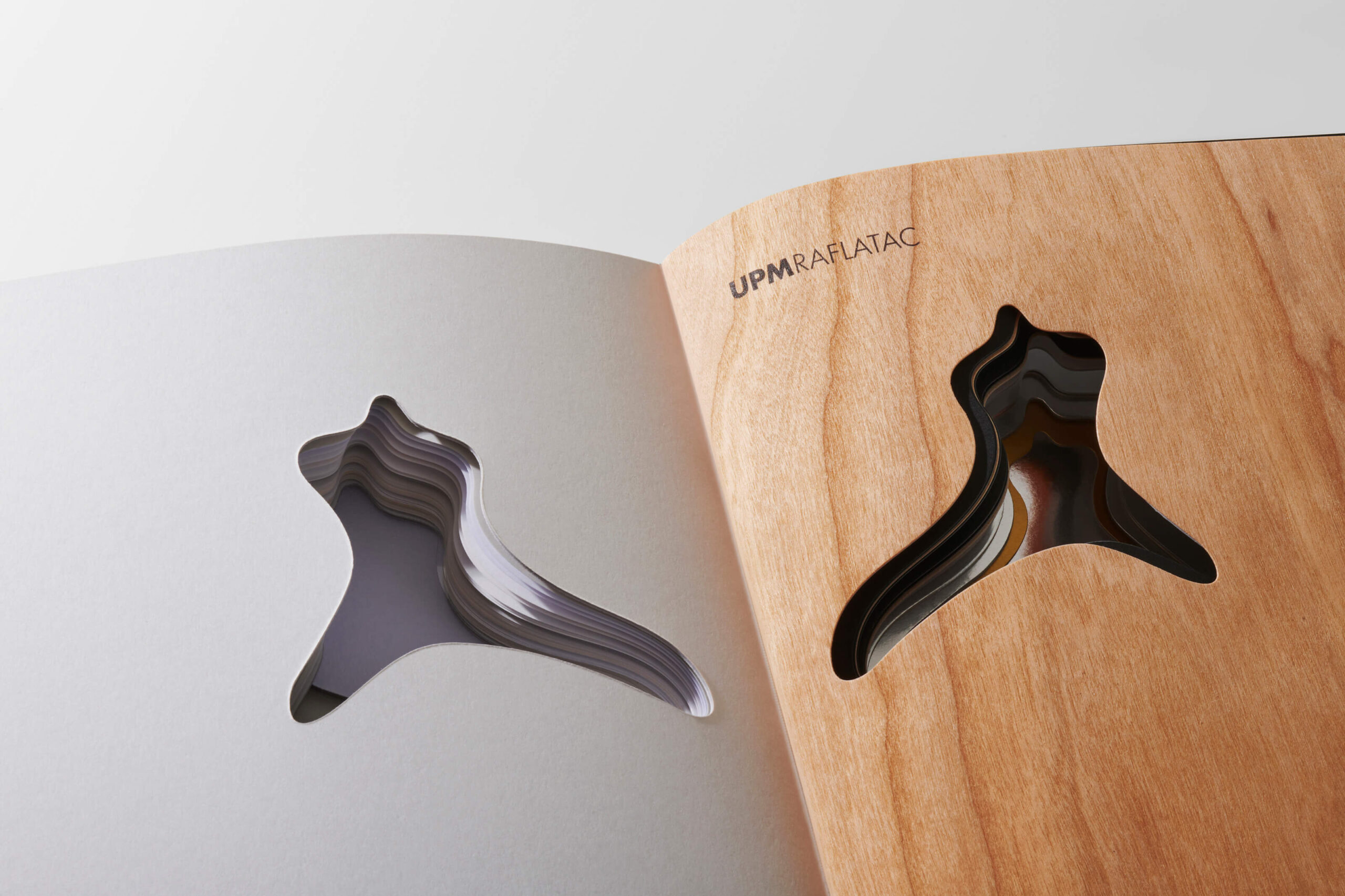
Un ensamblaje de materiales cuya estratificación compone un paisaje que recuerda con sencillez los orígenes de la empresa. Finlandia es un país con casi 2000 lagos, y las texturas en capas perforadas muestran el paisaje en su esencia.
UPM RAFLATAC SWATCHBOOK
Diseño del catálogo de materiales para etiquetas UPM Raflatac, intentando convertir una herramienta de trabajo en una experiencia táctil, visual e inspiradora.
Sostenibilidad y sensibilidad
UPM RAFLATAC
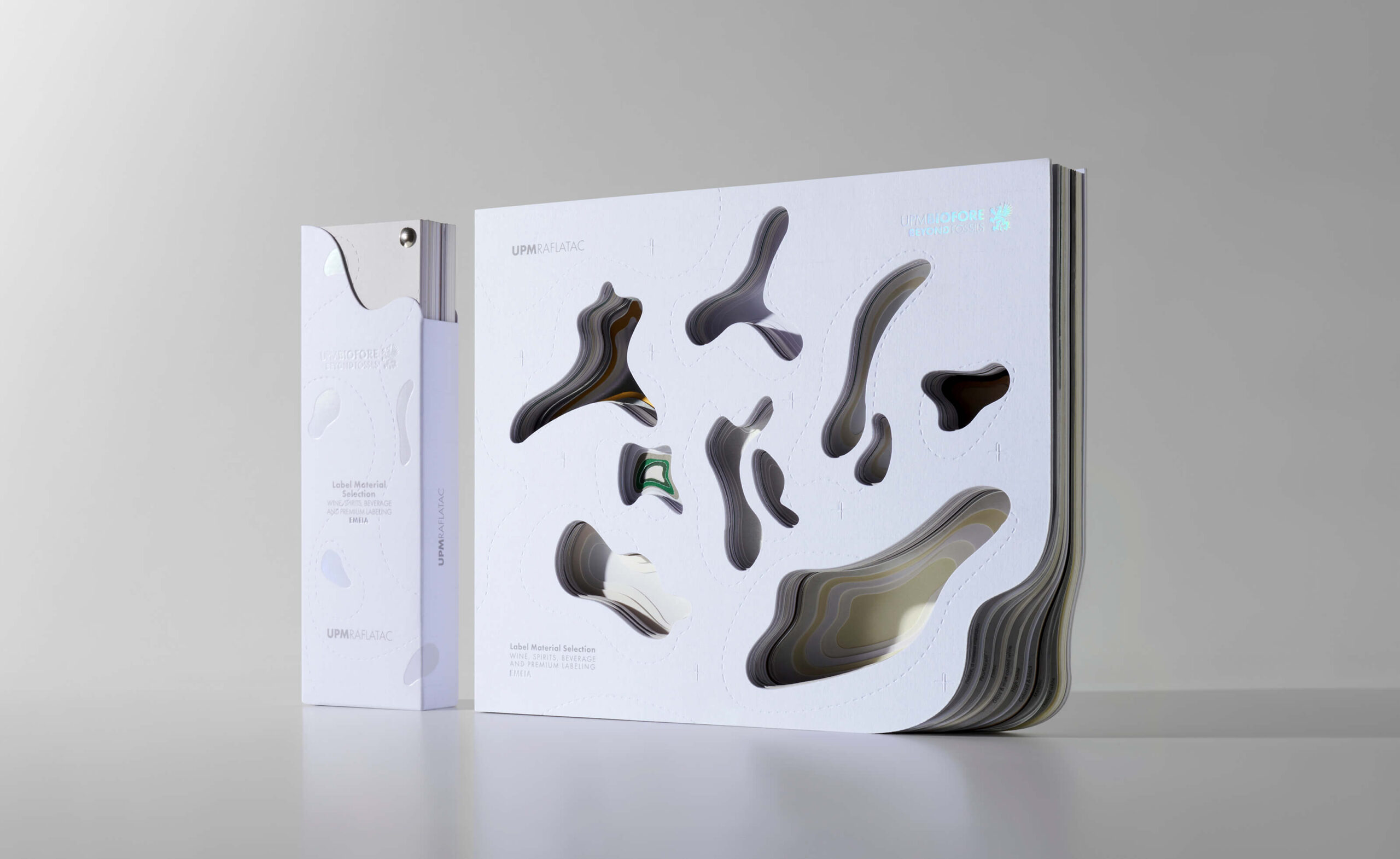
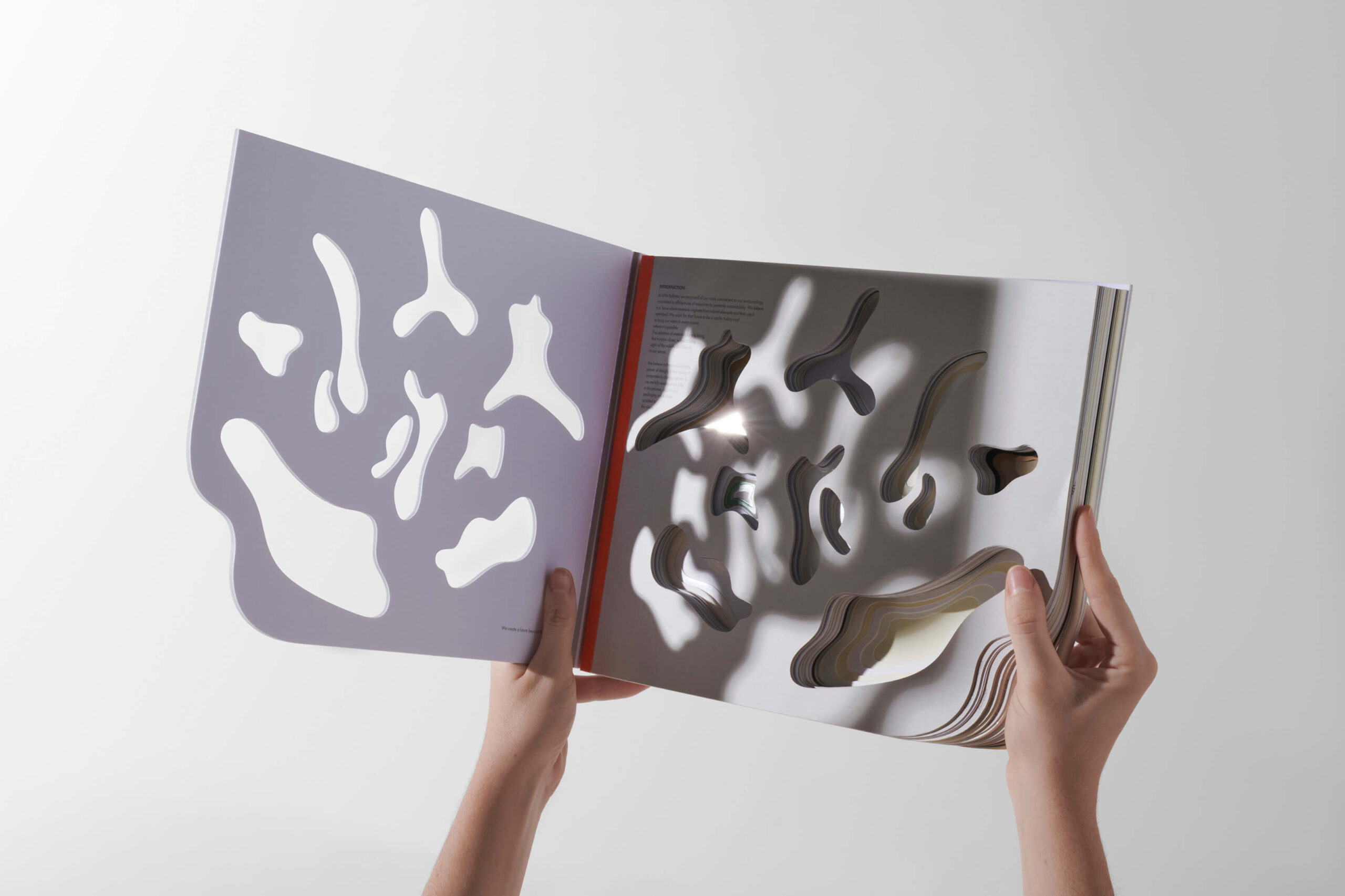
Más allá de un simple muestrario de papel, el libro se convierte en un objeto, lleno de significado y representatividad para la marca y su esencia.
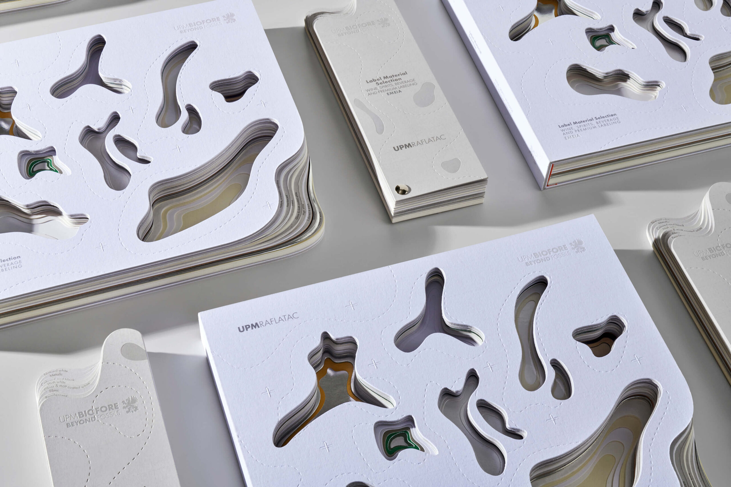
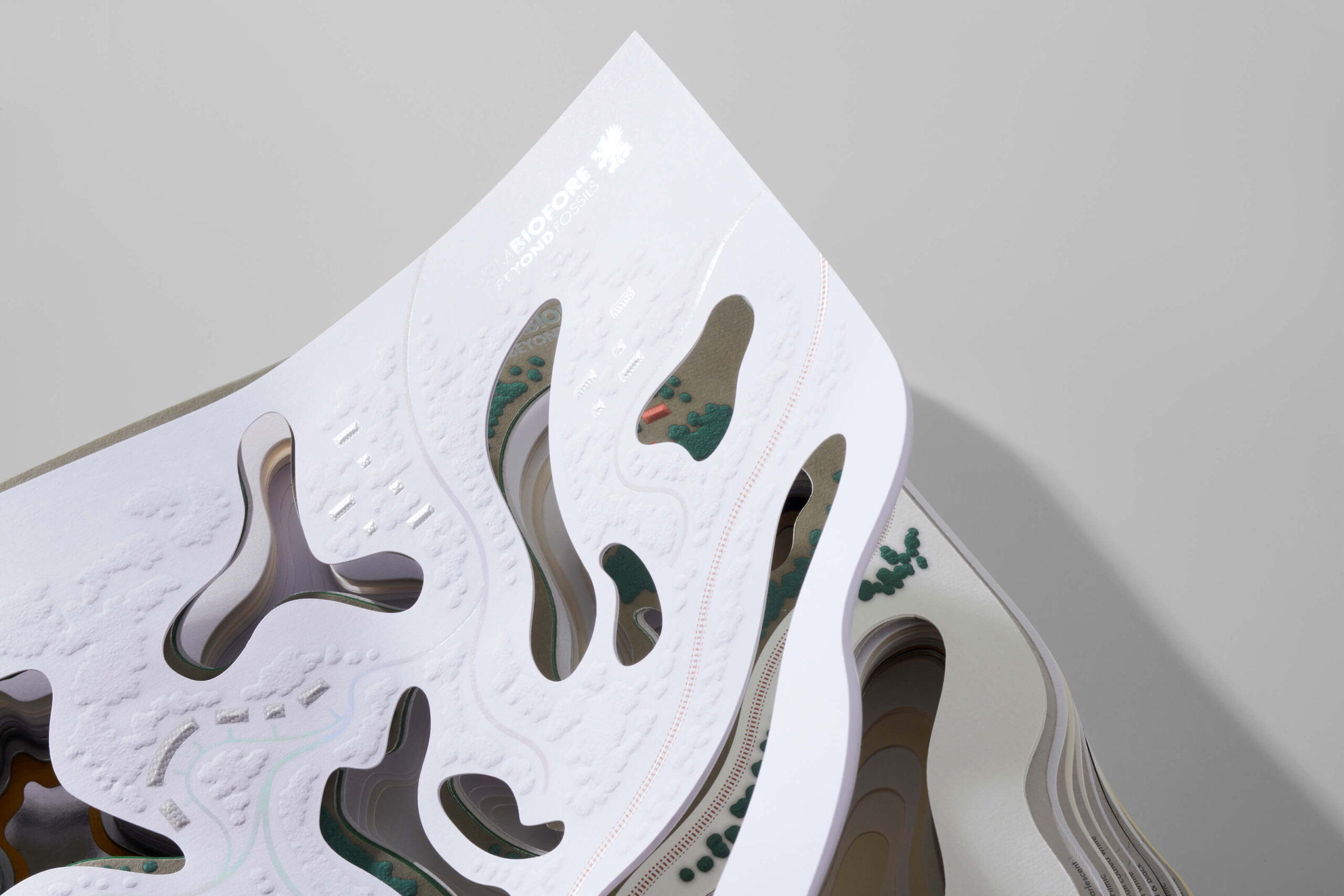
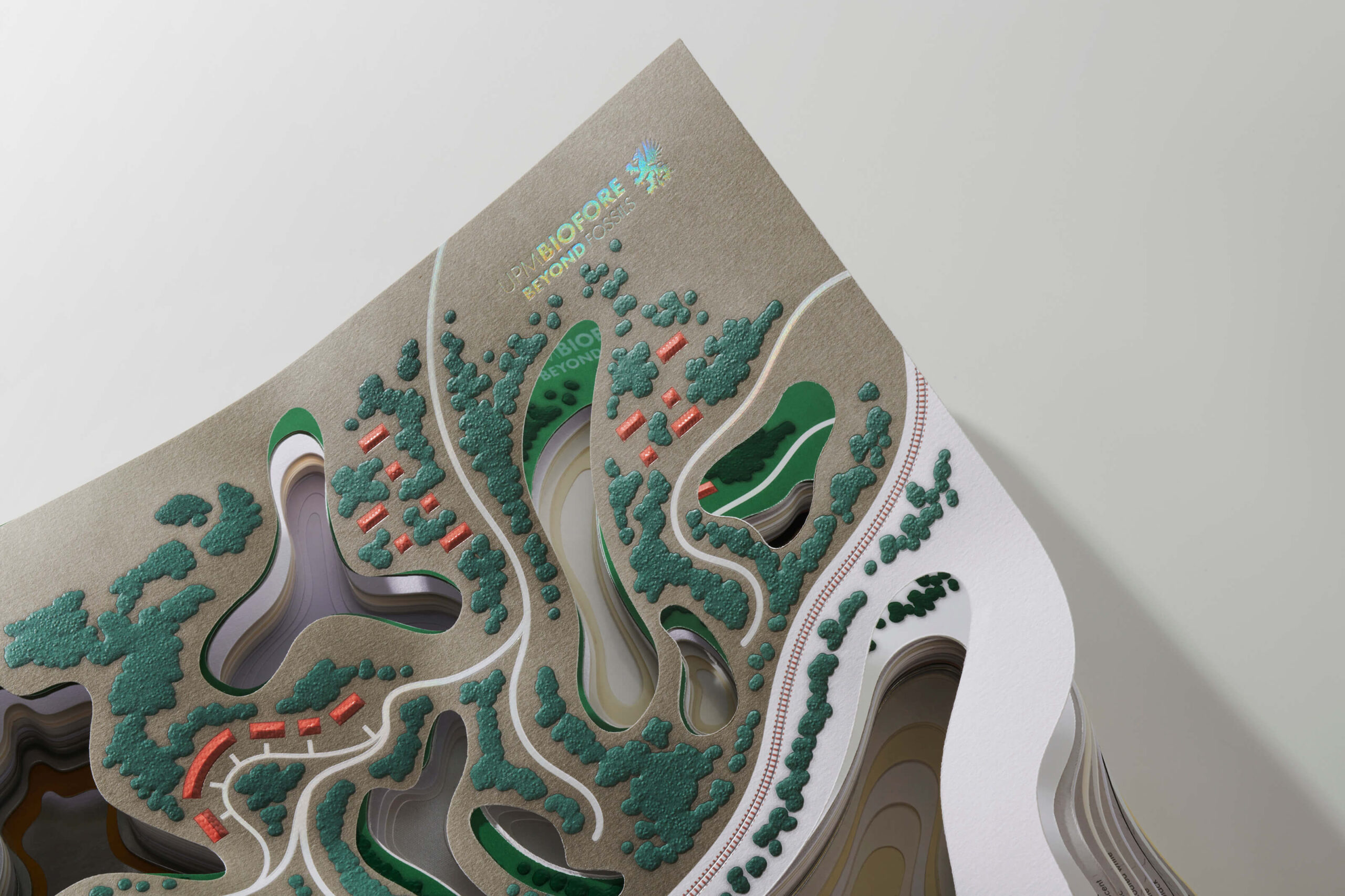
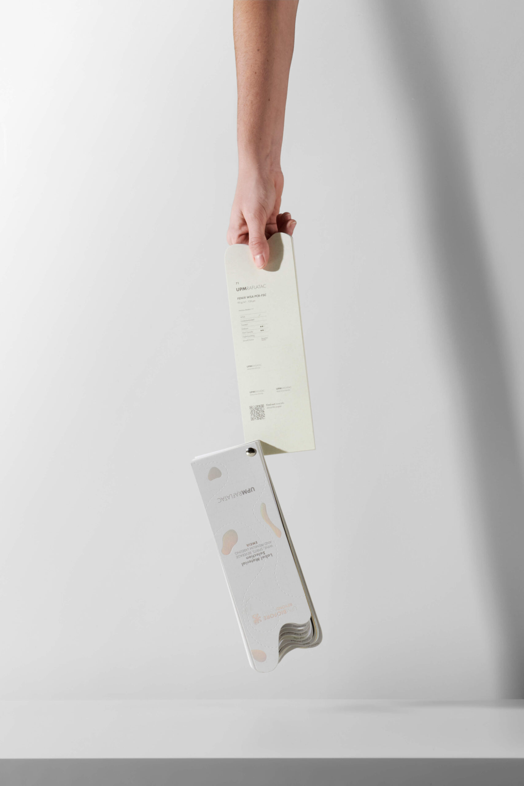
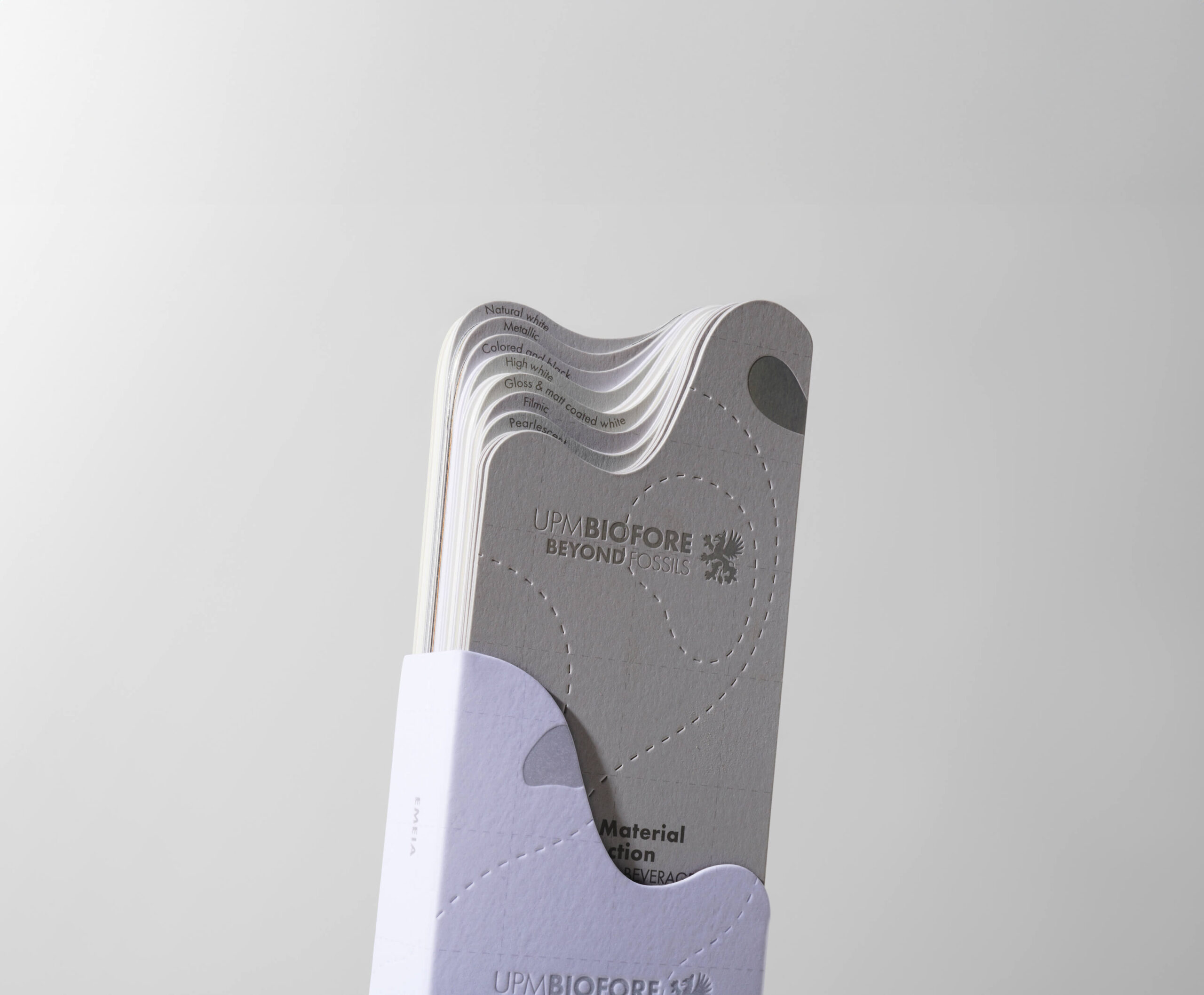
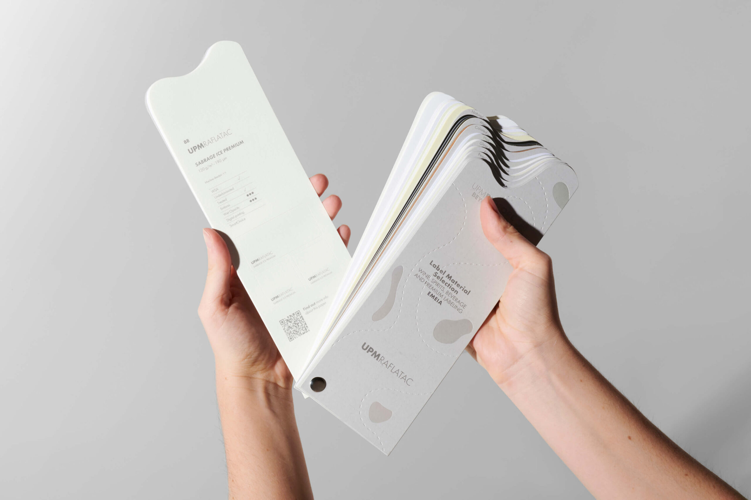
El catalogo consta de dos piezas conectadas. Una pieza general que muestra todos los papeles en piezas grandes, perforadas e ilustradas, creando la narrativa de marca, y una pieza de mano, necesaria como herramienta de trabajo para diseñadores, impresores y marcas.

Red Dot (2025, , Product Design)
Pentawards (2025, Oro, Stationery)
Pentawards (2025, Plata, Self promotion)
Lo que hacemos
Continua para volver