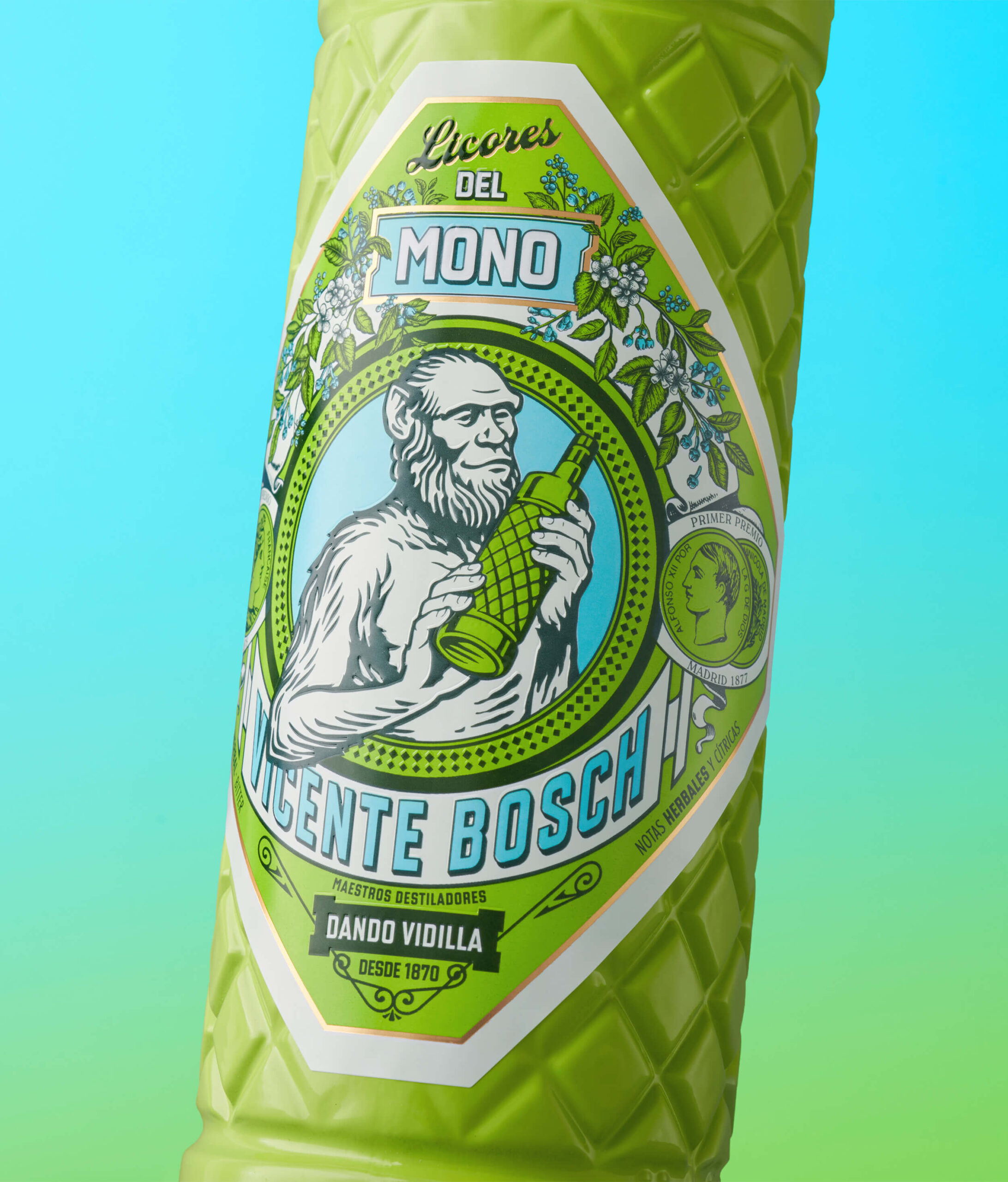
Con Licores del Mono, trabajamos desde el respeto a la historia de Anís del Mono, manteniendo elementos clave como la botella diamantada y el emblemático mono, pero reimaginándolos con una estética refrescada, más expresiva, colorida y actual.
Licores del Mono
Diseño de la nueva gama de Licores del Mono, en una expansion del porfolio del mítico Anís del mismo nombre.
El Mono se viste de color.
Grupo Osborne
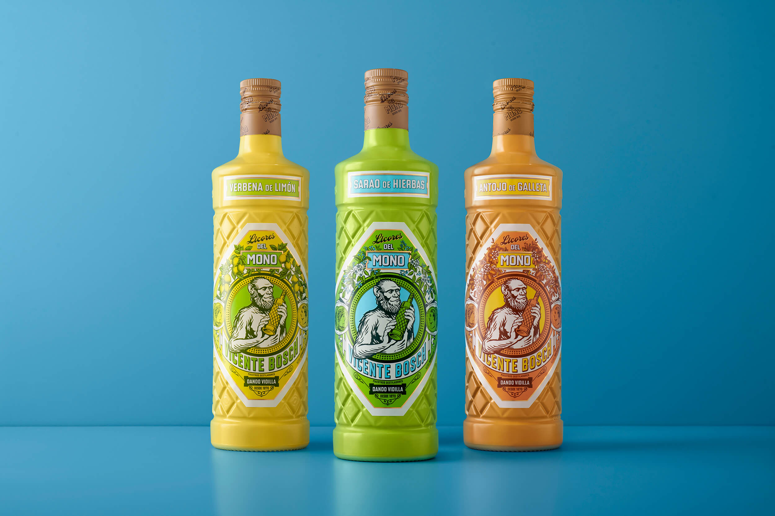
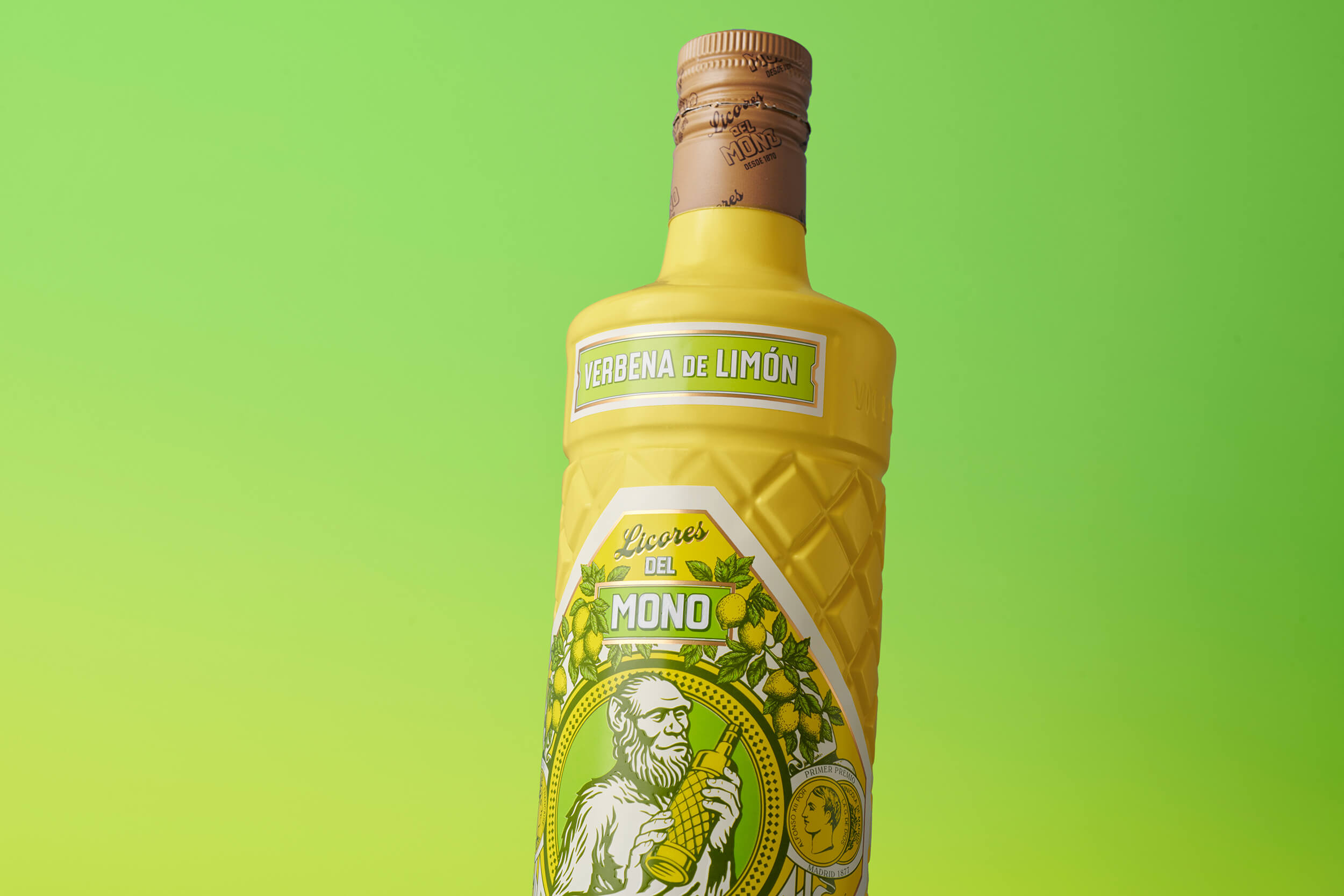
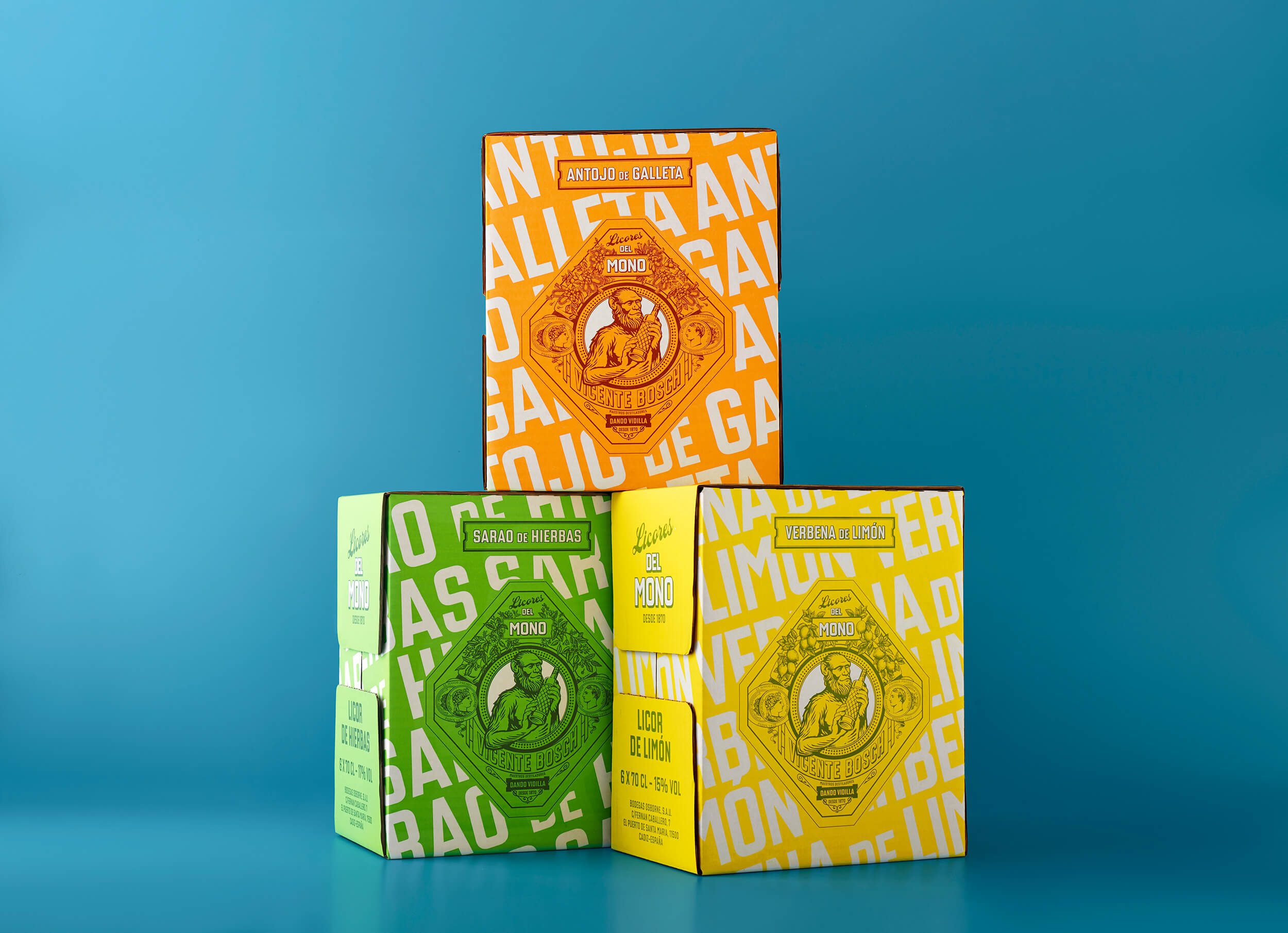
Cada sabor cuenta su propia historia visual. Apostamos por ilustraciones frescas y orgánicas para las versiones de limón y hierbas, y una atmósfera dulce y nostálgica para la crema de galleta. El mono se convierte en el protagonista gráfico, con una actitud más viva, cercana y festiva.
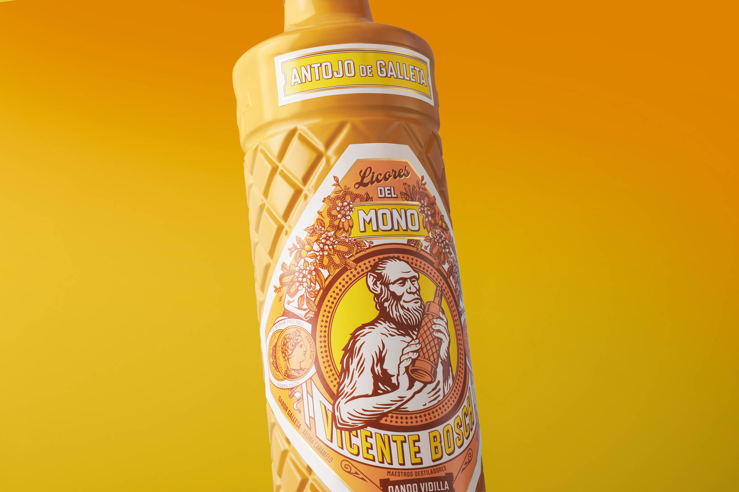

El naming desarrollado para cada sabor, busca un lenguaje emocional y popular que hablara de sobremesas alegres y encuentros informales. Así nacen Sarao de Hierbas, Verbena de Limón y Antojo de Galleta.
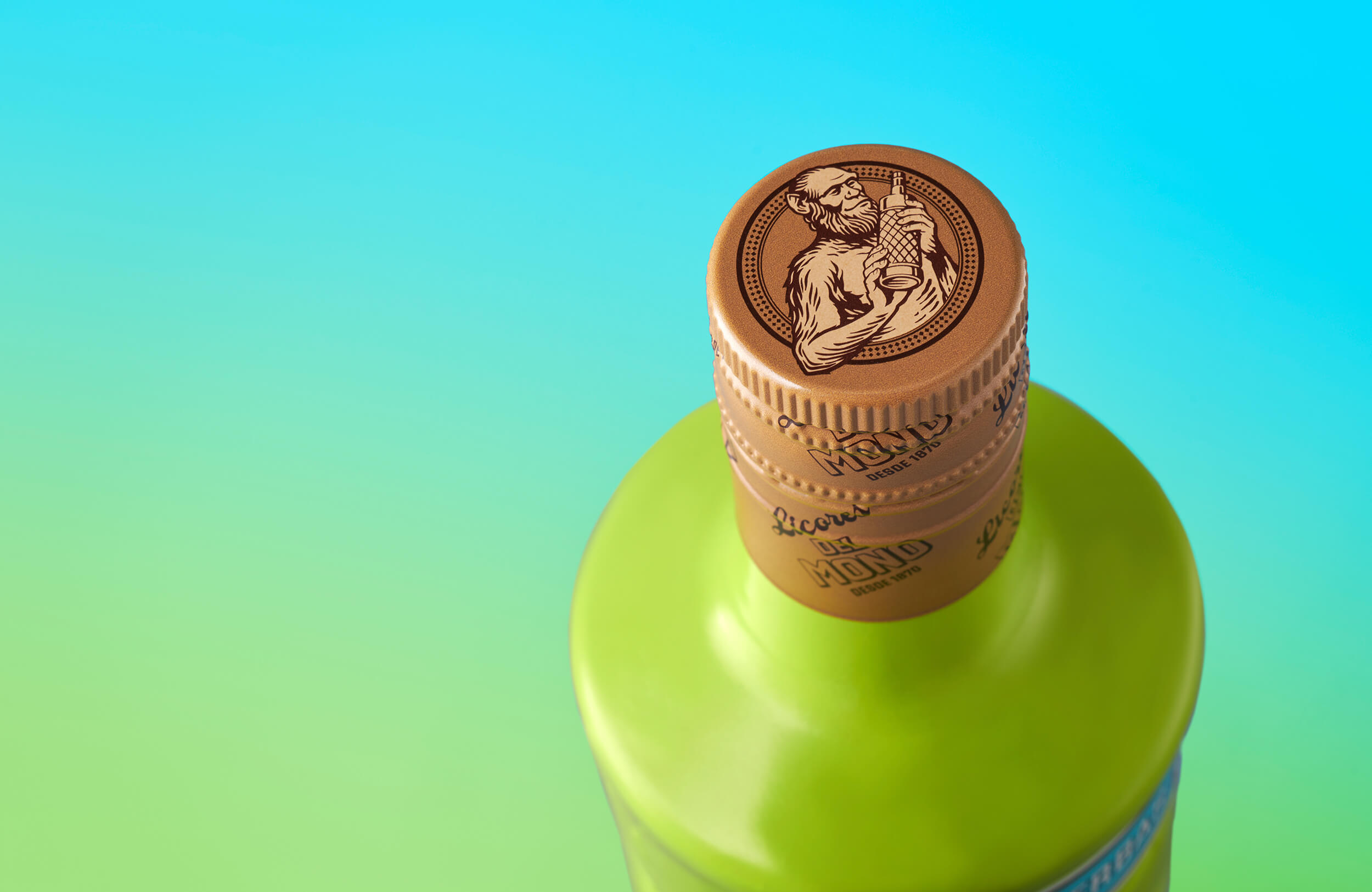
Cuidamos cada detalle técnico, desde los acabados táctiles de las etiquetas hasta un tapón más sostenible, que reduce procesos sin perder carácter. Con esta colección, queríamos ampliar el imaginario de la marca sin perder su alma histórica y mediterránea. Una propuesta pensada para conectar con un consumidor que valora el diseño, la autenticidad y el placer de compartir.
Best!N Food (2026, Oro, Packaging - Bebidas Alcohólicas)
Lo que hacemos
Continua para volver