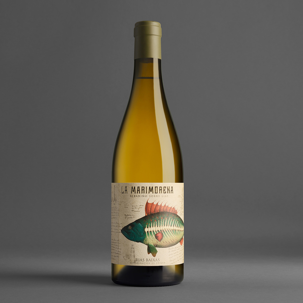
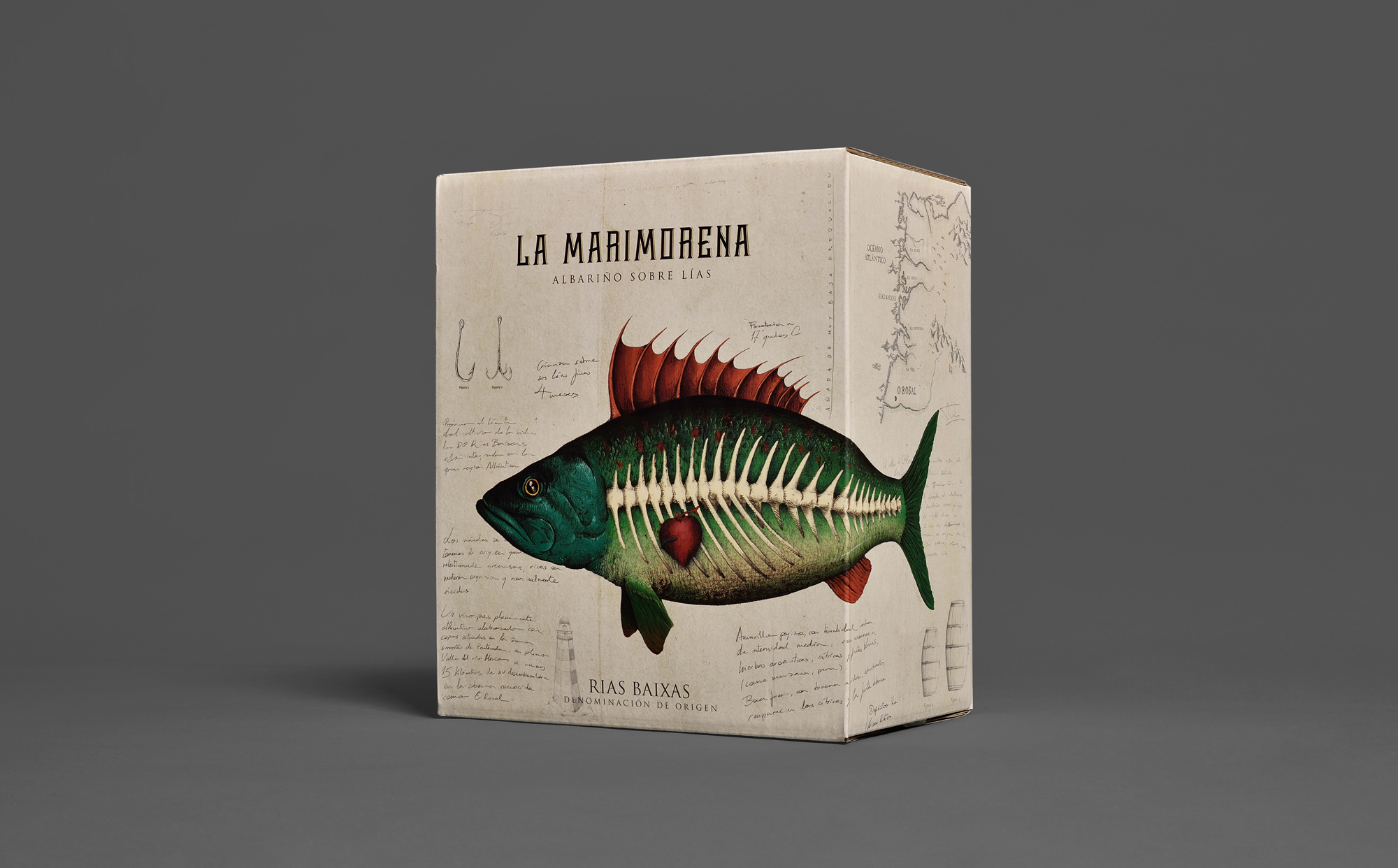
La Marimorena 2016
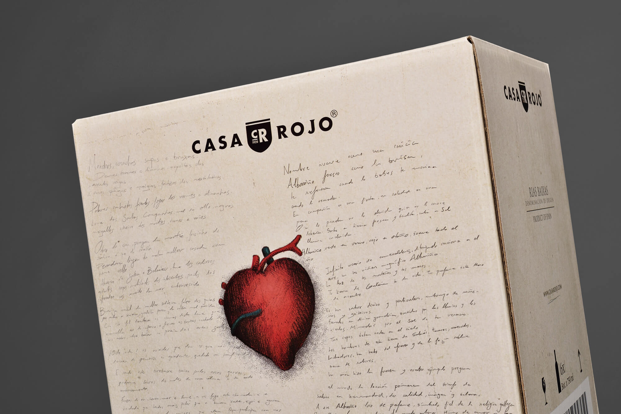
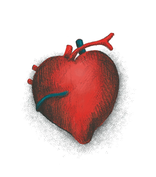
Un año mas el Albariño La Marimorena reviste su etiqueta para la nueva edición. El reto del briefing para el diseño de esta añada era el de sofisticar y elevar el tono de la comunicación sin perder su personalidad. La ilustración del pez pasa por lanzar una mirada hacia atrás, hacia las ilustraciones clásicas de las antiguas fichas de naturaleza y botánica, añadiendo a este código visual una buena dosis de emocionalidad.
Albariño, Rias Baixas
Bodegas Casa Rojo
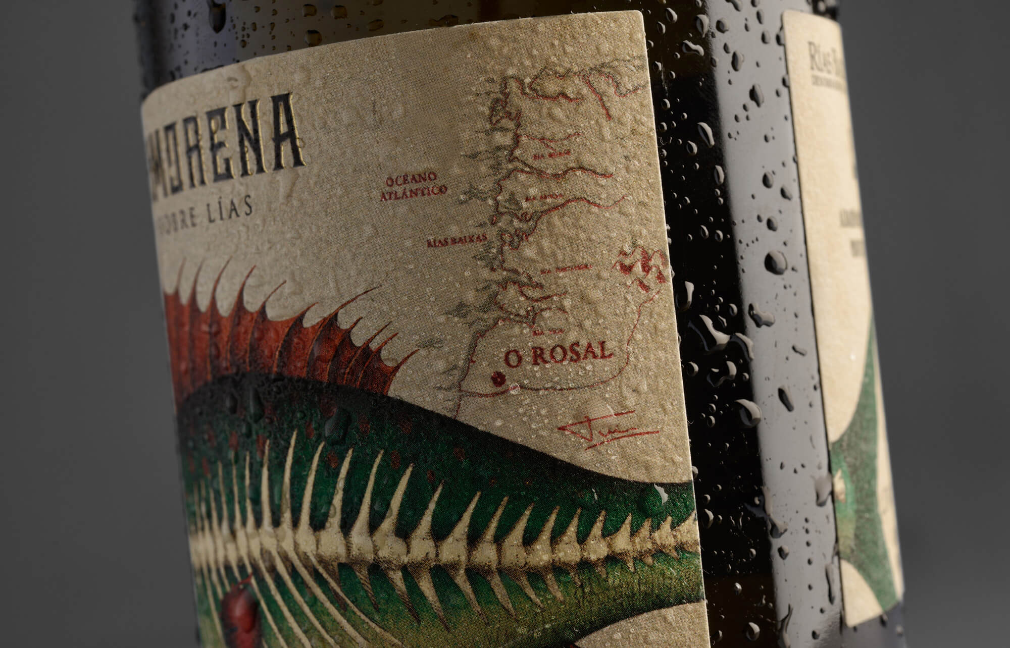
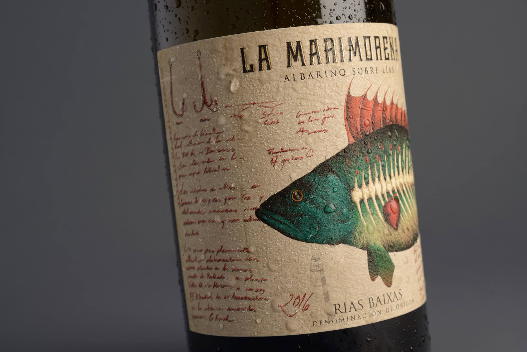
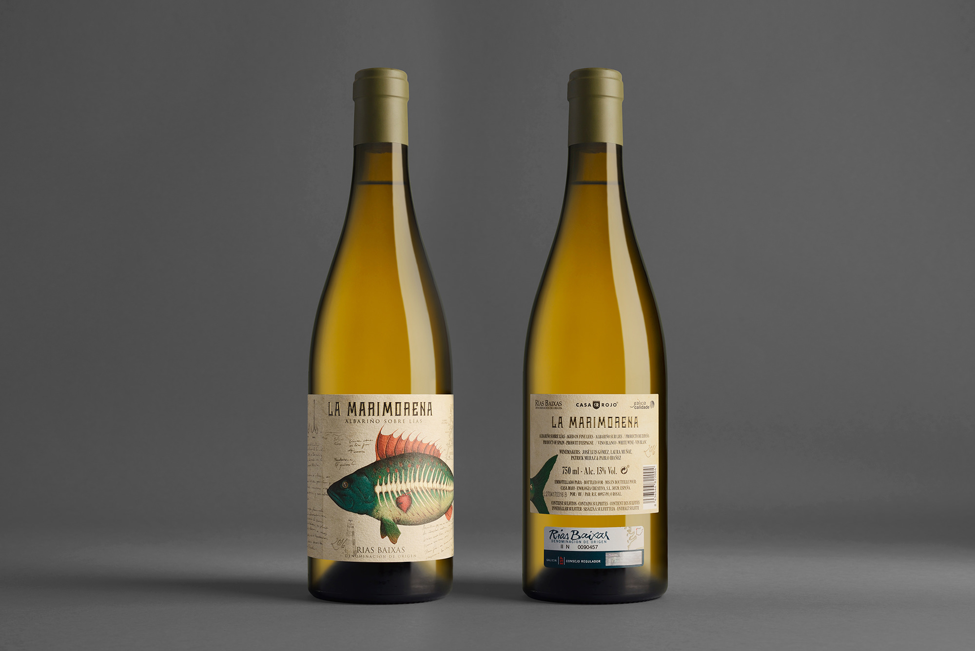
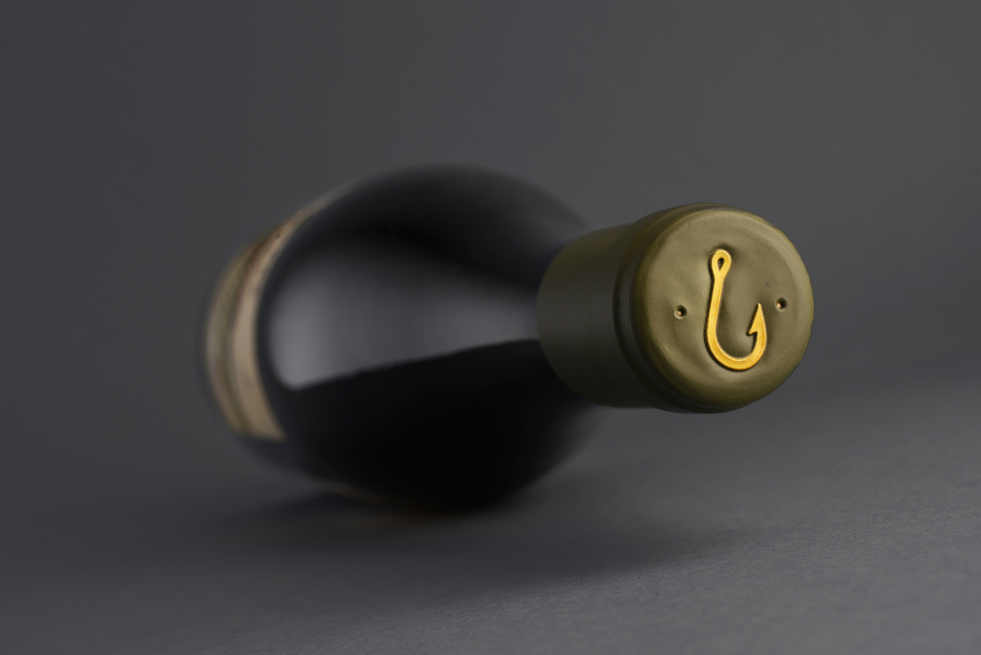
La tinta termosensible actúa como indicador de la temperatura de consumo, además de enriquecer la experiencia. El resultado del diseño de esta etiqueta es delicado a la vez que poderoso. Una armonía de colores sobre un papel algodonoso que respira elegancia y atemporalidad.
Lo que hacemos
Continua para volver